Causes & Solutions For Poor Mobile Compatibility

With mobile traffic now accounting for the highest proportion of internet traffic, making sure your website has mobile compatibility should be a high priority. Otherwise, you may miss out on your website potential.
Here are some ways you can make sure that your website is better suited for mobile devices.
Legible Font Size
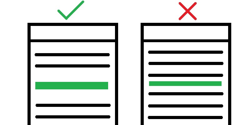
Visitors may have a hard time reading small text on mobile. It is recommended to have a font size of at least 12px.
Tap Targets
Tap targets are an element on a webpage that a user can interact with, such as buttons, ads, links, etc. This is what users can tap when using a touch screen.
Having a website that is difficult to navigate on mobile due to poorly sized tap targets. It is recommended that tap targets should be around 7mm (48 pixels) tall or wide.
When adding buttons to a page ensure that they are larger than the other textual content on that page.
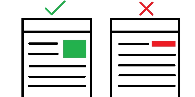
Additionally, buttons should have space around it in order for them to stand out from the rest of the text. Sometimes when a button scales down it begins to blend into the content which defeats the purpose of the button acting as a call-to-action.
Responsive
Responsive design, enables your website to adapt to any device and screen size, this is for both mobile and desktop. What this essentially means is that various aspects of your website change depending on the device and screen size the website is being viewed on. This may include text and images changing size, the layout of the content being adjusted or menus having different formats depending on the device. A quick and easy way to see if a website has a responsive design is by changing the size of your browser and seeing if the content adapts to the new size.
Find out the health of your website Here!
See our blog for more Web Performance Tips.
Connect with us on LinkedIn.
Related Posts